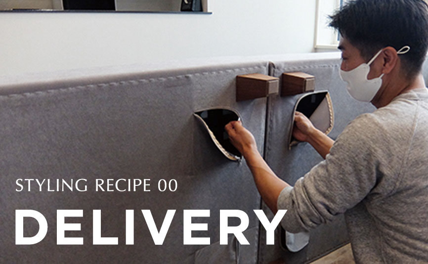
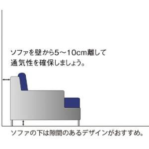
【旧記事】APPENDIX
Table of Contents
Coordinate with cold colors
Just by looking at it, cold colors can calm the mind and give the impression of sincerity and calmness. They are also suitable for situations that require concentration, so we recommend that people who often work remotely from home take advantage of this effect.
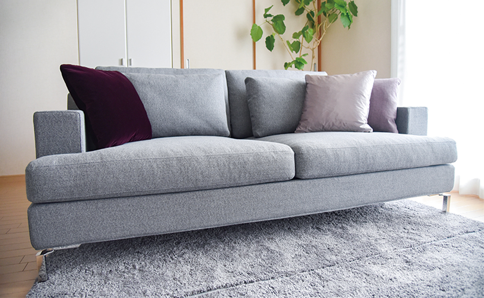
Tress recommended cold-toned fabrics
Cold colors are called retrogressive (contracting) colors, which appear to move backward. Conversely, warm colors are called advance colors, which appear to jump forward and may give too strong an impression. Recommended cold colors are "blues. Here are some coordinates that incorporate blue sofas, which give a fresh and cool impression.
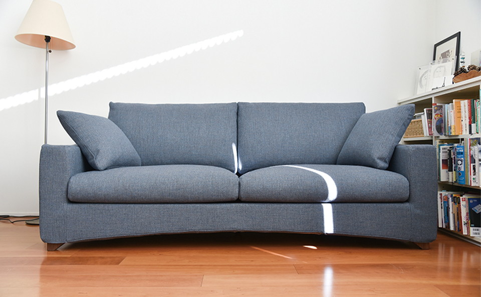
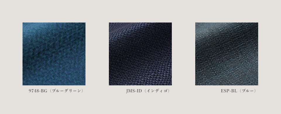
sofa [EE] 3P
cover fabric:ESP-BL(Blue)
A sofa in pale blue with a hint of color. It brings a fresh ocean breeze to the living room. We have created a soft atmosphere without using strong accent colors.
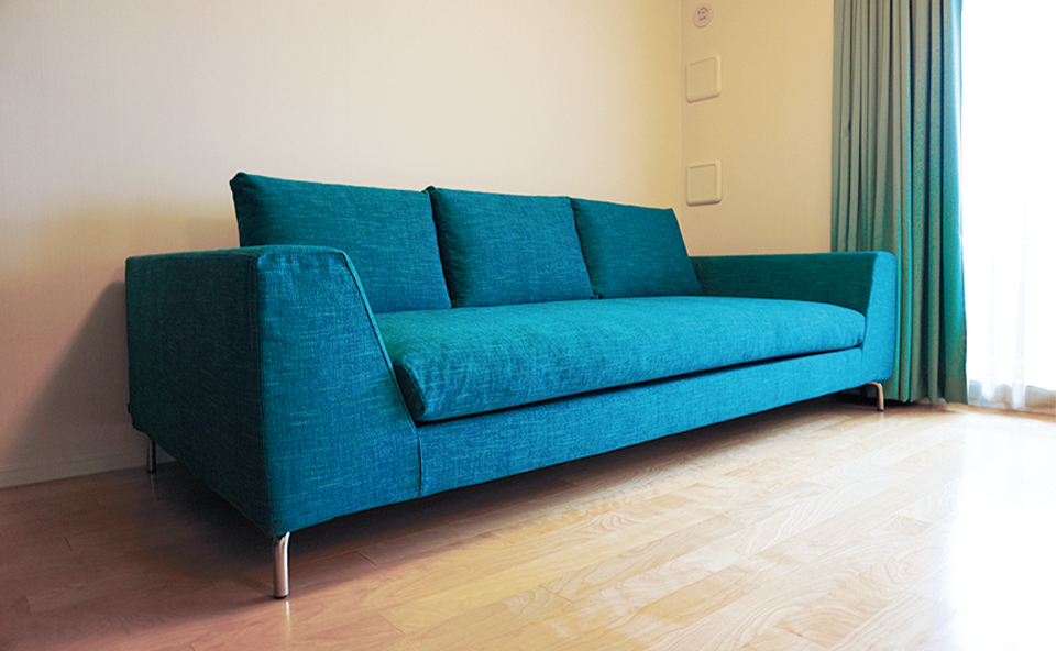
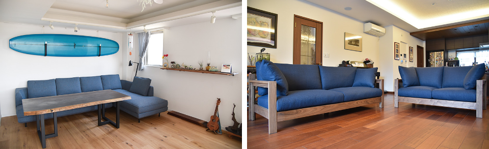
sofa [FSB] 3P
cover fabric:ZS-TQ(turquoise)
FSB] is a sofa with plenty of depth that can create a sense of openness like the endless sky and ocean. The combination of refreshing blue colors creates a cool and comfortable living room. The walls of Japanese homes tend to be white and dreary, but by using a similar color for the curtains and other elements, blue is scattered throughout the space, creating a resort-like atmosphere.
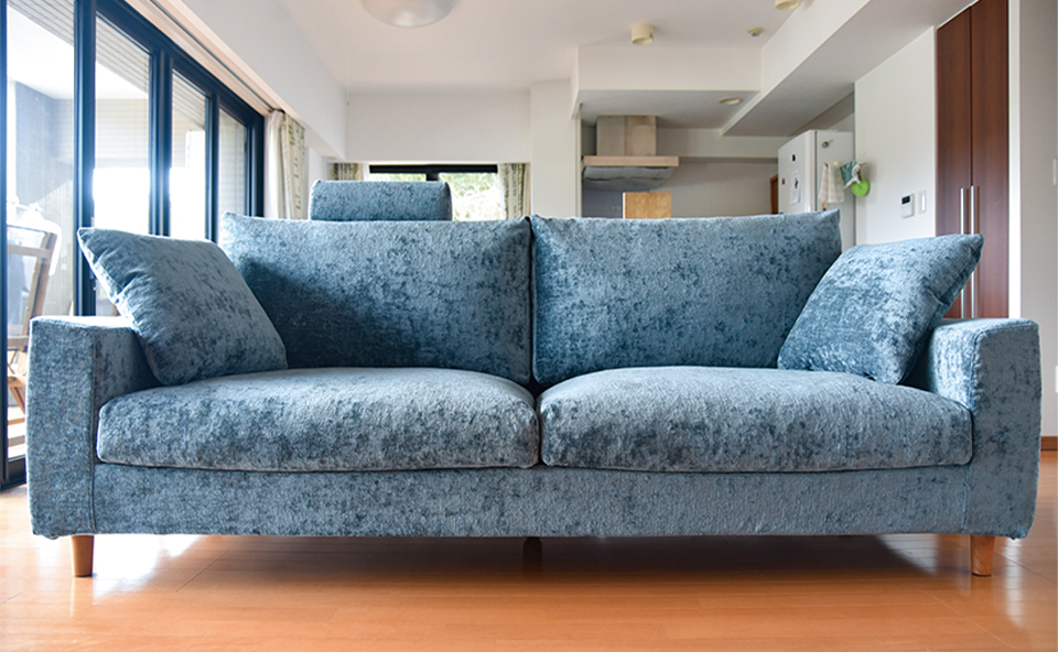
sofa [EF] 3P
Cover fabric: CUR-BG (blue-gray)
A soft and comfortable sofa [EF] is placed in the center of the living room, with fabrics in shades of blue-gray. The combination of the refined and elegant gray and the cooler color that creates a sense of spaciousness creates a smart and stylish impression. Wooden legs add warmth.
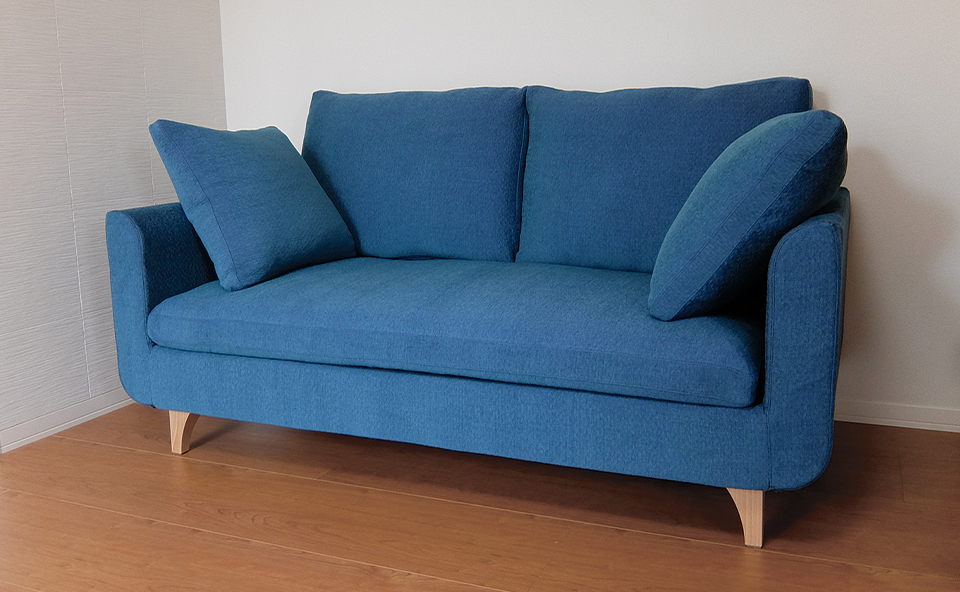
sofa [HM] 2P
cover fabric:9748-BG(blue green)
We have matched the sofa [HM], which is compact but provides firm support up to the shoulders, with a vivid blue fabric. Blue is a color that is very useful in a limited space. It is called a "receding" or "shrinking" color, and its effect is to make a space look more spacious, so you can create a room with a clean, uncluttered impression without a feeling of oppression. You can successfully change the look by layering rugs and cushions in neutral colors in summer and winter, respectively.
Incorporate cold colors in cushion covers
Cushion covers have an excellent "masterful" position in interior design. They give a new look to a familiar sofa or room. In addition, the various sizes of TORES cushions add a sense of rhythm to the color impression. Summer or winter, this is a versatile item that changes the look of the season with the addition of just one.

sofa [JFH].
THE SOFA [JFH] FEATURES A CLEAN, STRAIGHT FORM WITH A ROUNDED, ELEGANT DESIGN. BASED ON A LIGHT BLUE TONE, THE CUSHIONS ARE BLACK TO MATCH THE LEG COLOR OF THE LIVING ROOM TABLE, AND WHITE TO HARMONIZE WITH THE CLOTH. THE IMPRESSION IS QUIET AND CLEAN. YOU CAN ALSO CHANGE THE BLUE CUSHIONS TO RED OR ORANGE TO ENJOY THE SOFA STYLE IN AUTUMN AND WINTER.
sofa [GRVA].
GRVA" IS A SOFA THAT PROVIDES A RELAXING AND COMFORTABLE STYLE. THE SOFT IMPRESSION OF WHITE IS MATCHED WITH SATIN BLUE CUSHIONS. EVEN WHEN USING TWO COLORS LIKE THIS, THE TWO COLORS HAVE A COHESIVE AND FASHIONABLE IMPRESSION BY CREATING A CRISP TONE.
SOFA [EF] (Japanese only)
THE LOW TYPE SOFA [EF] IS SOFT AND COMFORTABLE. THE GRAY STRIPES GIVE IT A CALM IMPRESSION, BUT THE FRESH LIGHT BLUE CUSHIONS STAND OUT AND GIVE IT A STYLISH LOOK.
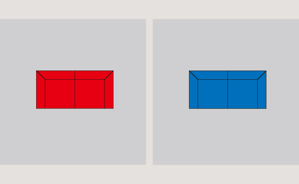
POINT: ABOUT THE ADVANCING AND RECEDING COLORS
When a red sofa and a blue sofa are placed at the same distance, the red sofa appears to be placed closer and the blue sofa appears to be further back. Thus, even when placed at the same distance, colors that appear close together are called "advance colors," while colors that appear far apart are called "receding colors. Think of a familiar object, a traffic signal. Red is the advancing color and is easily noticeable, so it is used for stop lights.
We hope you have felt that the atmosphere and impression can be changed by introducing cold colors. Changing the sofa cover or matching cushions is as easy as changing clothes in room coordination. Whether you are just starting to choose a sofa or already have one, please enjoy the sofa style according to your mood.
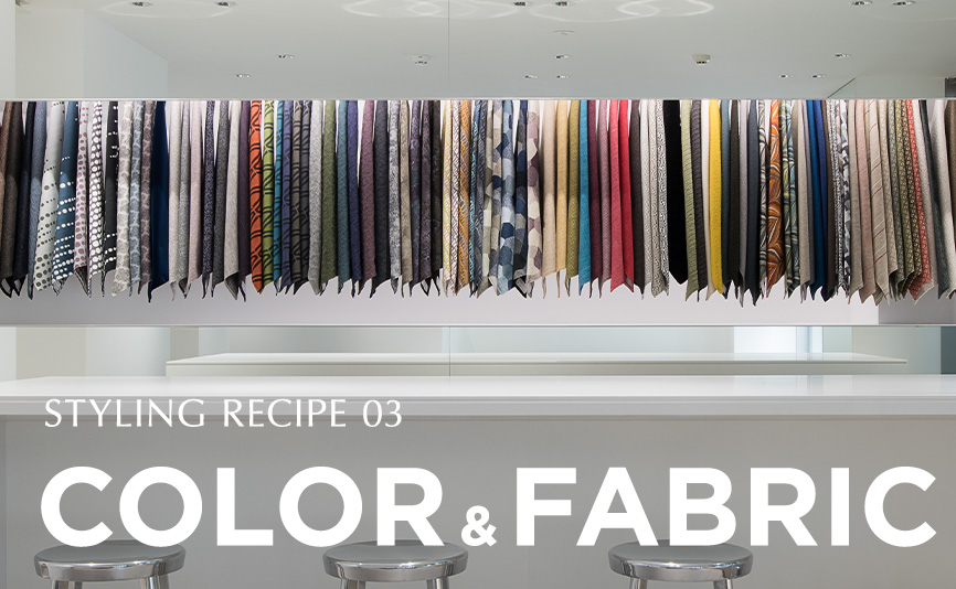
Practical Examples of Tress Recommended Fabrics
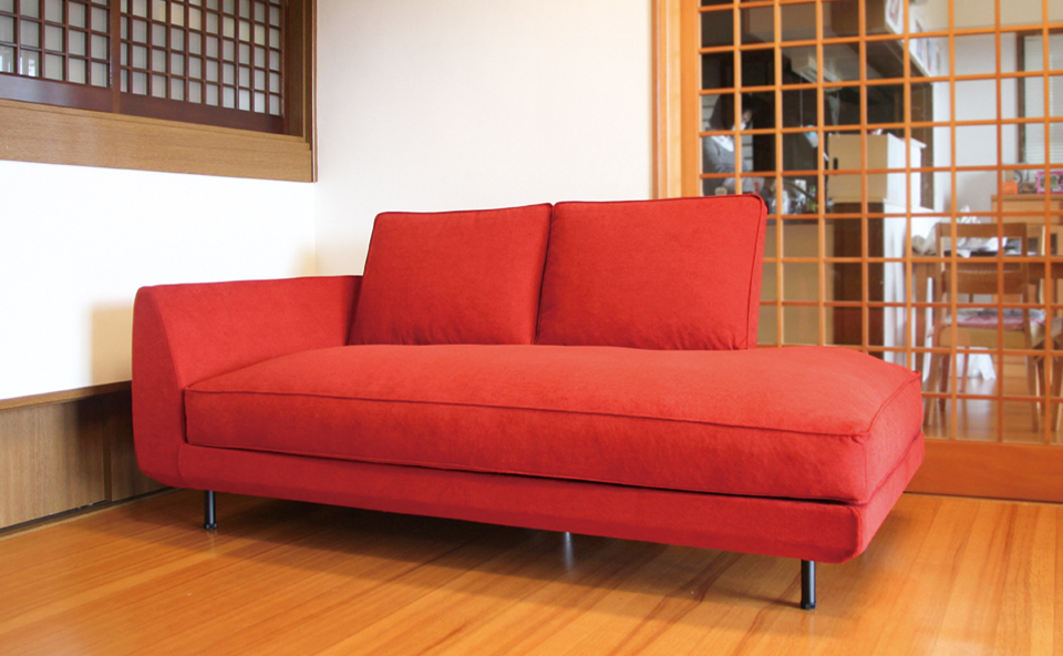
Red: Color that gives brightness and vitality to a space
Red is a color with bright and aggressive images such as "passion," "courage," and "excitement. It gives brightness and vitality to a space and is highly effective as a color of advancement. We recommend that you use this color only after fully understanding the impression it gives because of its strong positive connotation.
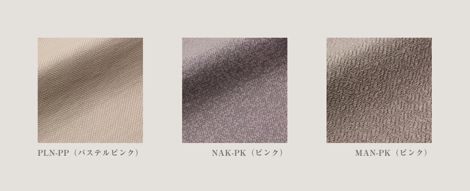
Pink: calm and gentle femininity
Pink is a color that makes one feel gentle and calm. Because it is similar to the color of flowers such as cherry blossoms and roses, it overlaps with the image of spring and women. The pale shade evokes an image of softness, while the vivid shade is associated with passion and sex appeal. At first glance, pink has a strong impression of prettiness, but by adjusting the area and tone, and by carefully assessing the texture, you can enjoy a variety of expressions. The higher the tone, the lighter the impression, so good planning is required.
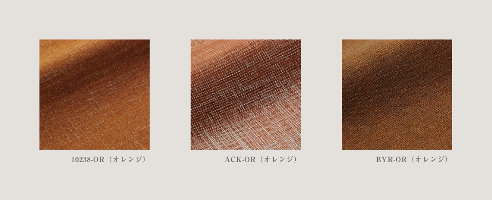
Orange: a friendly color that stimulates appetite
Orange, the color between red and yellow, is bright, vivacious, and healthy. It is close to the color of the earth and trees, making it an easy color to feel familiar with. It is also recommended for living and dining rooms, as it stimulates appetite and communication. However, be careful not to use too much of this color, as it can be noisy and give a cheap impression.
Green: the color of "nature" that gives the viewer a sense of security
Green evokes images of nature, life, and growth, and has the effect of reassuring people when they are tired or feeling restless. It is said that looking at green helps to recover from eye fatigue, and because it has a strong image of health, it is an easy color to express spaces that are related to health and relaxation.
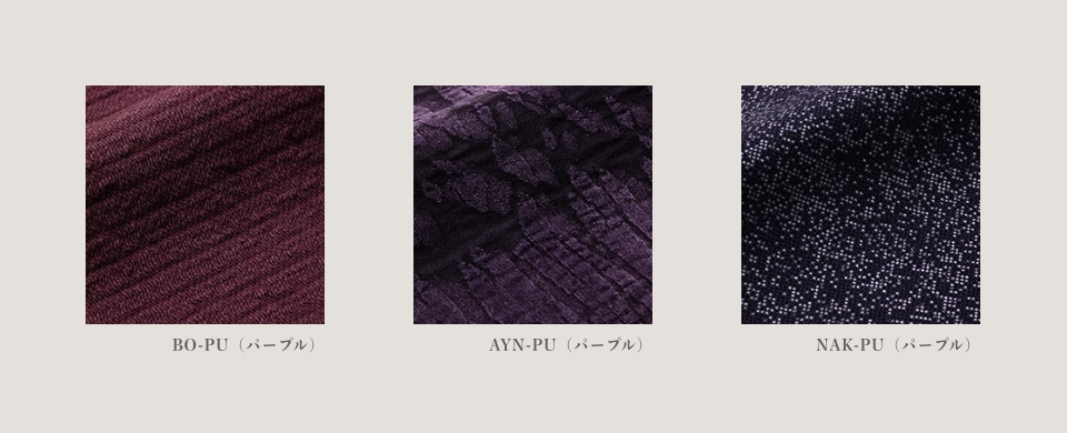
Purple: a noble image, suitable for gorgeous spaces.
Purple is associated with nobility, elegance, and grace in both the East and the West. It is said to suppress the metabolism of energy, and to reduce respiration and heart rate, while at the same time, it is said to improve intuition and sensitivity. It is often used to create a sophisticated atmosphere.
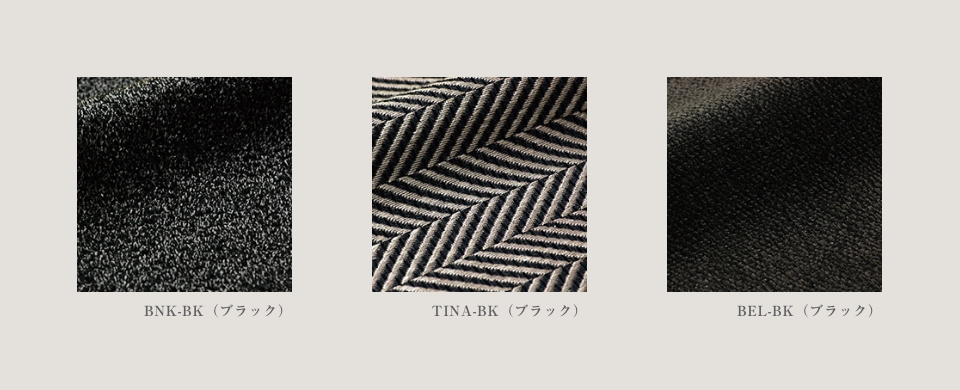
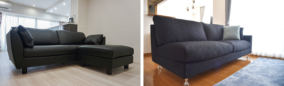
Black: Adds a sense of weight and luxury and creates status
Black gives a sense of weight and luxury to a space and has the power to enhance the colors it is combined with. It is also highly effective in making a space look smaller and heavier, and is an essential color for using color effects.
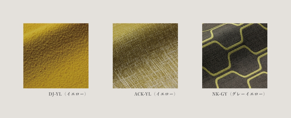
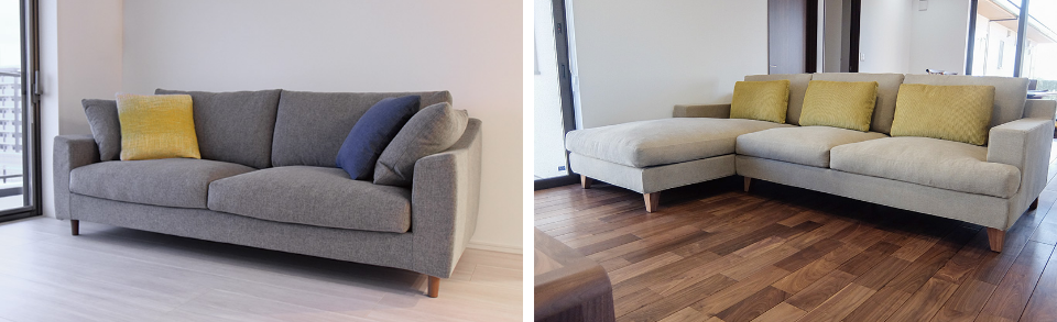
Yellow: Accent color that attracts the eye
Yellow, the color of the sun, brightens the atmosphere of a space and increases its vitality. On the other hand, as often used in road signs, it is easily recognized from a distance and attracts attention. As a result, using it over a large area may cause a sense of fatigue.
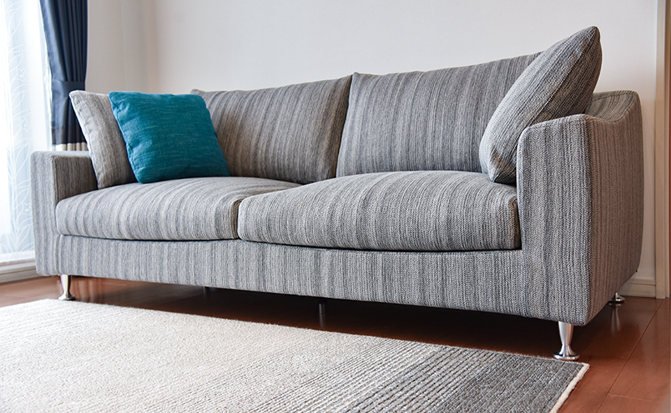
Blue: color that enhances concentration and judgment and promotes intellectual activity
Blue has a sedative effect and is said to lower blood pressure and heart rate. Because it improves concentration and judgment, it is used in business and academic settings to convey an image of "intelligence," "calmness," and "confidence. However, since it is representative of cold colors, it can give a cold impression. The key to this color is what it evokes, such as the sea, sky, or summer.
Tea: A relaxing space surrounded by a sense of security
Brown is the color of soil and tree trunks. It evokes an image of "solidity" and "stability" and gives a sense of security. The color should be lighter than skin tone in areas higher than the eye level and darker than skin tone in areas lower than the eye level to create a sense of security.
White: clean and bright, making the room look larger and brighter.
White is the color of light and is associated with "purity" and "happiness. It is recommended for kitchens and living rooms because of its high light reflectivity, which makes spaces look spacious, bright, and clean. However, dazzling white can tire the optic nerve, so consider off-white or ivory first.

Featured green-colored sofa
I am sure that many of you have devised ways to spend your time at home and change your mood. We would like to introduce the charm of green color and how to use it to make your daily life a little more refreshing.

The image we get from greenery is of vitality, vitality, and comfort. In particular, the fresh beauty of new greenery gives us a sense of anticipation for the new season. Although green has recently become associated with healing, it was not until the 1960s that we began to apply its effects to our living environment. In an effort to achieve a color effect, the interiors of Japan National Railways trains were repainted green, which was a hot topic at the time as a restful and gentle color for the eyes. It is said that passengers responded well to the new color, and they were able to relax so much that they forgot about the passage of time and did not feel like they had ridden for a long time. Nowadays, as people spend more and more time at home, there is a growing interest in creating an environment where people can refresh themselves in moderation. Green is an intermediate color mixed with blue and yellow, and is easily harmonized with surrounding colors, making it a color that should be actively used.
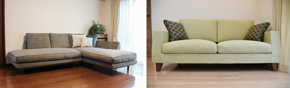
Green sofa as the star of the show.
Depending on the color you choose, the atmosphere can be natural or luxurious, from bright green to subdued green. The color of the floor can also change the impression, so please refer to this page for more information.
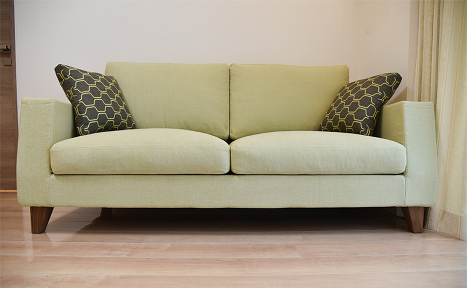
sofa [GF] 2P
size:W1800/D900/H800/SH400
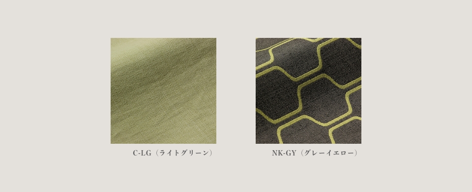
Cover fabric: Main body of sofa C-LG (light green)
cover fabric: side cushion NK-GY (gray-yellow)
walnut leg
Sofa [GF] has a depth that is easy to sit in among the TORES. The light beige flooring and gentle light green fabric give the space a fresh impression. The left and right cushions are coordinated with a geometric pattern fabric. The space is accentuated and tightened up.
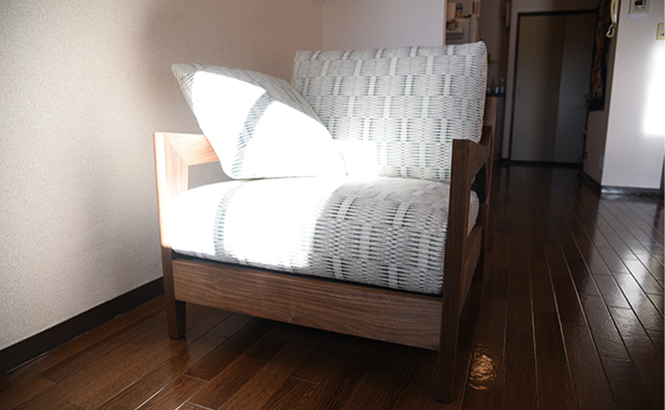
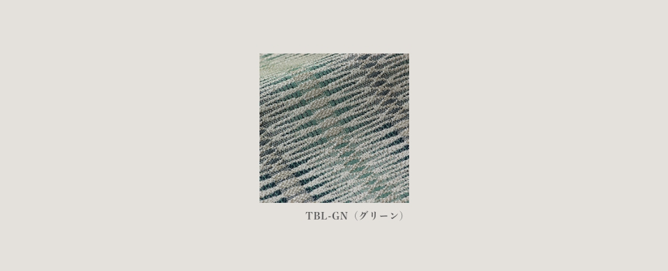
sofa [RF] 1P
size:W750/D850/H790/SH400
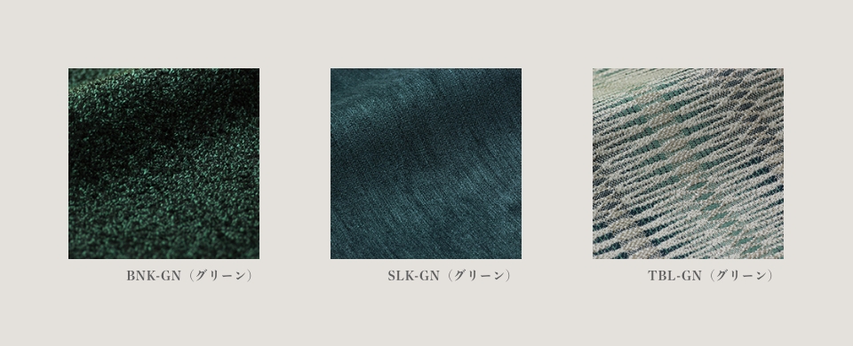
cover fabric:TBL-GN(green)
Wood species: Walnut
Small patterned fabric is matched with sofa [RF] in this style. The green-toned pattern goes perfectly with the black walnut frame. The solid wood frame can create a relaxing atmosphere that will help you unwind.
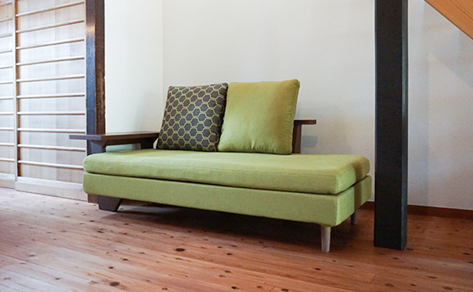
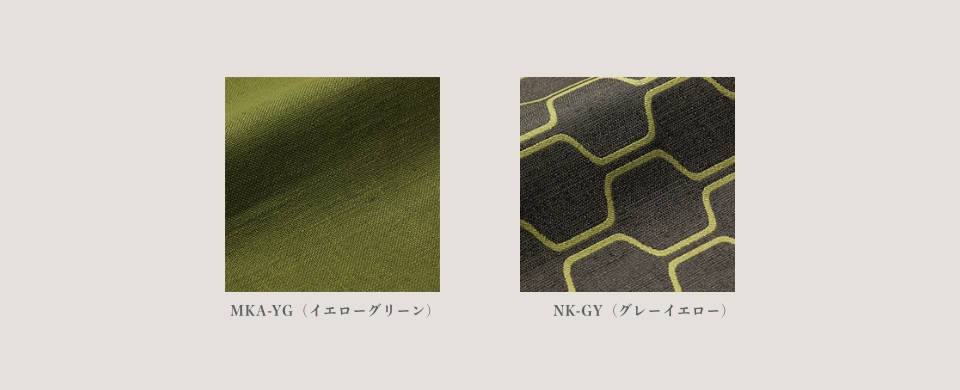
sofa [TB-M] 2P single arm
size:W1800/D900/H780/SH370
Cover fabric: Main body of sofa MKA-YG (yellow green)
Cover fabric: Cushion NK-GY (gray-yellow)
walnut leg
SOFA [TB-M] fits perfectly in the space under the stairs. Fresh and transparent yellow-green fabric and walnut frame. The fabric of the back cushion is matched with a small pattern. This coordination adds a sense of playfulness to the calm space, giving the impression of a positive lifestyle.
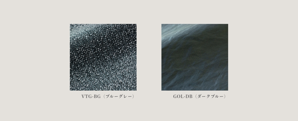
Bespoke sofa [JD] 2.5P
size:W2100/D930/H800/SH400
Cover fabric: VTG-BG (blue-gray)
PIPING: GOL-DB (DARK BLUE)
Black legs (Roomba compatible)
The soft and comfortable sofa [JD] is popular. The bluish green fabric with a sense of freshness and calmness is matched with a gentle beige tone with yellowish tints. The piping is made of satin material and the deep blue color creates a sense of luxury. You can enjoy a calm and relaxing time.

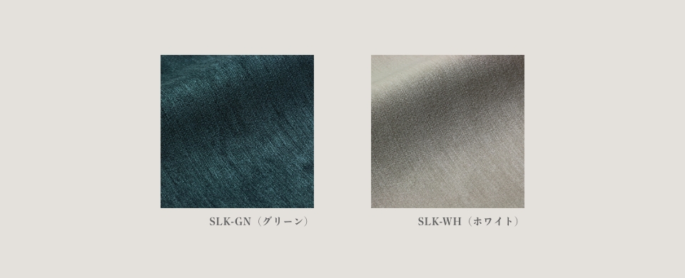
sofa [CONVEX] W2000
size:W2000/D845/H790/SH400
cover fabric:SLK-GN(Green)
OPTION PILLOW CUSHION 450 SQUARE: SLK-WH (WHITE)
Wood species: Walnut
The sofa [CONVEX] is beautiful from any angle. The warmth of wood can be felt from all parts of the natural space, and the deep green color adds a more modern touch. Green and brown always go so well together that they can be said to be a set, but the combination of green with a bluish tinge is even fantastic. You can enjoy different looks, refreshing in the daytime and glamorous at night.
Green with a strong presence to give the room a bright impression
For a quick and easy way to match greenery, we recommend matching small items such as houseplants, succulents, vases, and cups. Just by placing them in view, you will be healed.
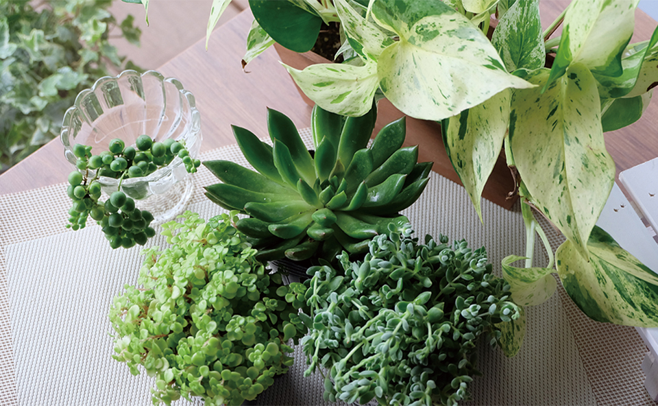
Air plants" are greens that can be placed anywhere, even in areas with poor sunlight. Recently, there are many varieties of air plants, and they are used in various places.
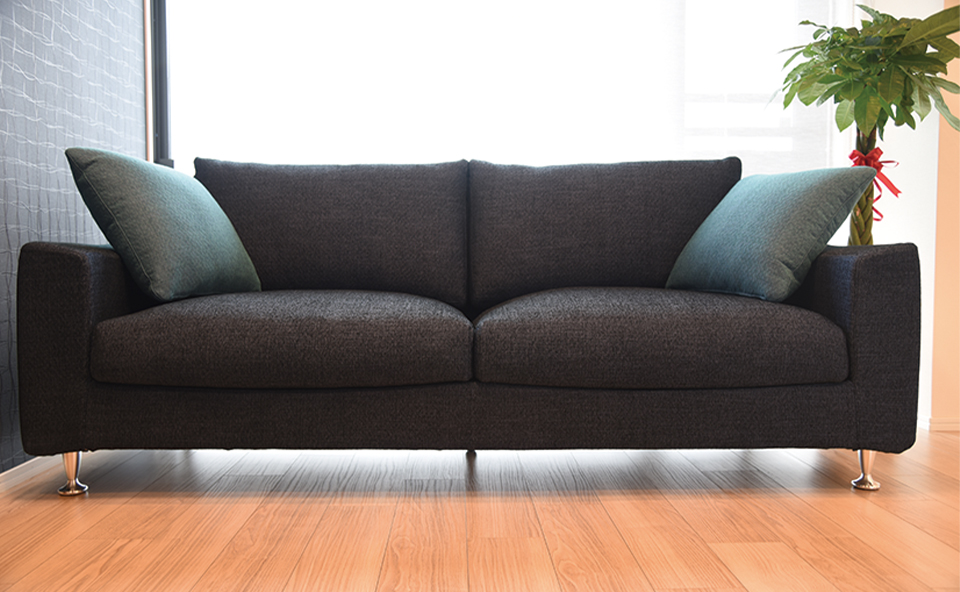
The sizes of pachira installed on the side of sofa [EF] vary from large twisted ones to smaller ones. They are widely used as interior greenery in the living room. The impression of the branches growing downwards is also relaxing.
This is an example of a sofa [GRVA] with a deep, sturdy form and a light, airy umbellata. The light gray fabric and greenery are a perfect match for the balance of both sofas. The umbellata is easy to form and is a good choice for interior design.
Decorating a living room table or side table with plants is also recommended. Smaller greens such as Asian thumbs and ivies can match any shelf or table.
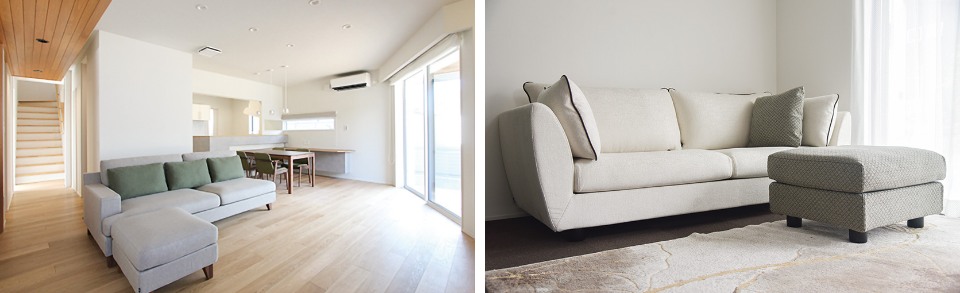
Sofa that doubles as a dining chair
The sofa is also used for dining, a style that has been seen in the past few years. As the role of the sofa increases, there are some tricks to choosing a sofa.
In the LDK type where there is no partition between the kitchen, dining room, and living room, a sofa can also serve as a dining room, making the space more spacious. In this case, what you need to pay attention to is the relationship between the sofa and the table. There are "two points" to make a comfortable living/dining room.
POINT 1 / THE SEAT OF THE SOFA IS "A LITTLE HARD".
A soft seat surface causes the body to sink into the seat, which puts a strain on the stomach when eating. Therefore, a seat with moderate firmness is optimal.
POINT 2 / NOTE THE "DIFFERENTIAL SCALE" BETWEEN THE TABLE AND THE
One thing to check is the difference scale, which represents the difference between the height to the table top and the height to the seat of the chair.
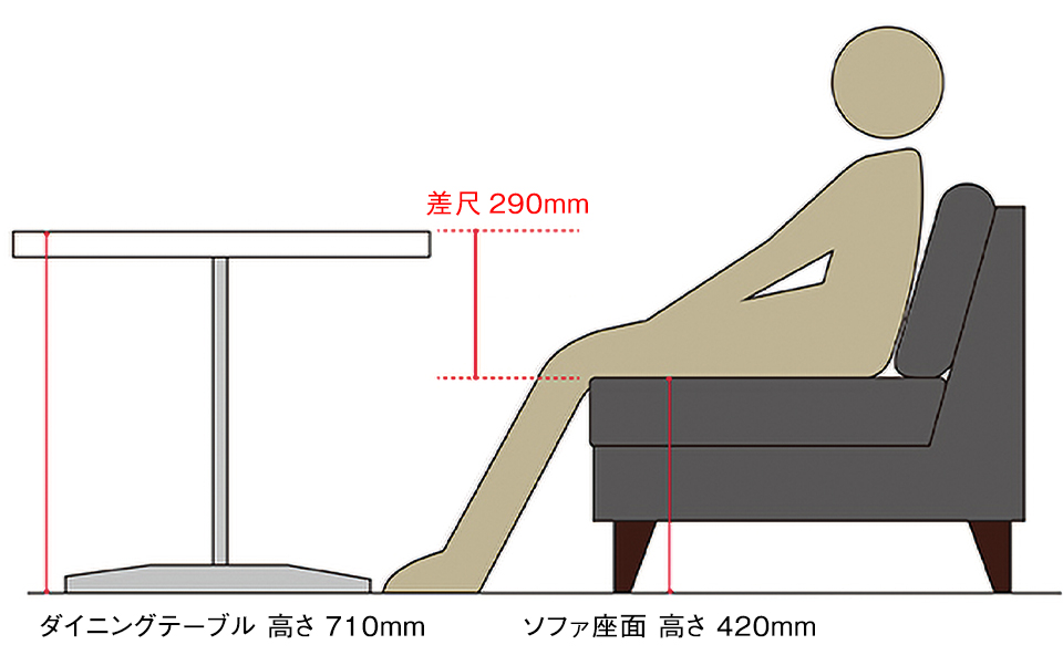
Formula for calculating the difference scale for your body shape
(Height x 0.55)/3 = Suitable difference scale
Example: In the case of a person 160 cm tall
(160 x 0.55) ÷ 3 = suitable differential scale is about 290 mm
For computer work, a differential scale of 20 to 30 mm minus another 20 to 30 mm is recommended.
TO AVOID MAKING THE LDK A CRAMPED SPACE OVERFLOWING WITH THINGS WHERE THE FAMILY SPENDS TIME TOGETHER, IT MAY BE A GOOD IDEA TO ABANDON THE STEREOTYPES OF A DINING TABLE IN THE DINING ROOM AND A SOFA IN THE LIVING ROOM. BY COMBINING THE DINING ROOM AND LIVING ROOM, YOU CAN CREATE MORE SPACE AND LEAD A MORE FULFILLING LIFE.